An early-stage startup sought to bring to market a mobile app that merged the experience of content and commerce—reimagining the concept of shoppable content.
During the early phases of this idea, I was tasked with imagining the future of the application, which was founded on a vision of a seamless experience between the two; idealistically a model for how consumers would engage and transact moving forward.

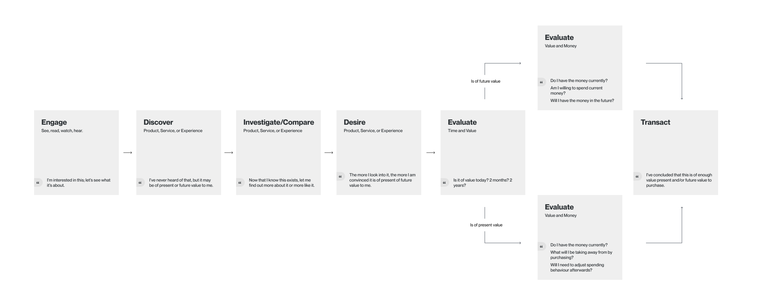
What I immediately understood was, there is an existing journey that consumers universally go through before transacting and an existing blueprint for how content and commerce are connected.
Put another way, content—the things we see, watch, read, and listen to—are a direct influence into the things we spend money on—products, services, and experiences.
From a business perspective, the task was to design an experience that conjured and capitalized on consumer desire. However, that task needed to be translated into a value proposition for the consumer, which I believed to be—curated consumer interests.
What I produced was a fraction of that concept—a few interactions illustrating the bridge between those two experiences, founded on 2 theories—shrinking the visual gap and reducing segmentation. This is demonstrated with articles as the content type, and physical products as the commerce type.
Shrinking the Visual Gap
Typically a consumer's experience with content (walking down the street, reading an article, etc) is separate from the commercial touchpoint (being in a store, online shopping) because they're in different locations, digitally or physically.
The company was in the process of establishing partnerships with content providers and commerce producers for the early phases (which is the foundation for a combined experience) so my exploration was under the assumption that the content being engaged with had relative products also hosted on the platform, as opposed to the affiliate model which redirects to the retailer's site.
The Layout and Architecture
Few ground details: Like many of the content-rich apps today, a vertical, infinite-scroll feed would be the foundational layout to this application. In this feed are a series of cards that preview a type of content and navigate to a full view of that content.
It was suggested by some stakeholders that users' desire would be less distracted if they didn't have to navigate between pages to view the content. In my opinion, the means to the end was questionable, but for the sake of iteration #1, I challenged myself to work within this constraint. This meant that instead of cards navigating to a full content page, it would appear in the same view.
One approach discussed was to switch axes and deliver content as horizontal cards. The other was to expand and collapse. A card approach required that content providers would have to reformat their existing articles, which proved to be more effort than resulting value.
The Carousel
The simple and obvious way to shrink the visual gap was by proximity. This was achieved by adding a product carousel in the associated content card. The intent was for this carousel to be reusable, where it can also be used on photos in an article's full view.
The carousel satisfies one or multiple products and accommodates the variable lengths of product names (to a limit) that would render the preview cards different sizes.
A simple solution, but brings a subtle presence of a product to a content type.
Reducing Segmentation
The experience of reading an article versus transacting on a product are inherently very different. Simply combining these two existing experiences into one risks complexity and confusion.
Granted, the aim was not to be so seamless that staring at a product image for 3 seconds automatically bills your credit card, but it was important to lessen the thoughts, feelings, and actions that typically come before, during, and after a transaction.
A wordy way of saying: When a user taps on a product among content, what does the transaction experience look like?
Given traditional transactions involve selecting options > adding to cart > going to cart > entering checkout > shipping details > billing details > reviewing order > confirmation, this interaction often takes place on separate pages or a modal. When thinking about how that interaction would function without swapping pages—in the middle of an article—the priority becomes getting through the transaction with the least friction and most confidence possible, then settling the user back into the content without disruption. This approach assumes a few details about the maturity of the app.
Variants: Behavior-Based Suggestions
Referring to the consumer journey that is discovery, desire, then transaction, and considering the concept of content amalgamating with commerce, the idea is, that the product variant shown would be suggestions based on a user's previous engagement with content and similar products.
Address: Preset Consistent Details
Given consumers often have a single or primary address, setting it in profile settings only, is done to promote a set-it-and-forget-it benefit. The expectation is, as a user grows with the experience, there will be more than one purchase over time and these details will be reused. The inclusion of a guest checkout is mismatched in an application whose value proposition prioritizes learned interests.
Shipping: Data-Based Suggestions
Shipping can be cheap and fast, cheap and slow, or pricey and fast. While every consumer would appreciate cheap and fast, when it's not an option, a suggestion can be made based on the user's prior purchases, item value, or item type to inform if a pricier or slower shipping option is truly a burden for that consumer.

Billing: Cash Account
Referring again to the consumer journey, the area with the highest friction is when a consumer is evaluating price. A multitude of factors weigh in on how much a consumer is comfortable with, but ultimately it comes down to value—relative to time and current resources. Simply put, a users asks: Do I need this thing now? Am I willing to give up what I have now for it?
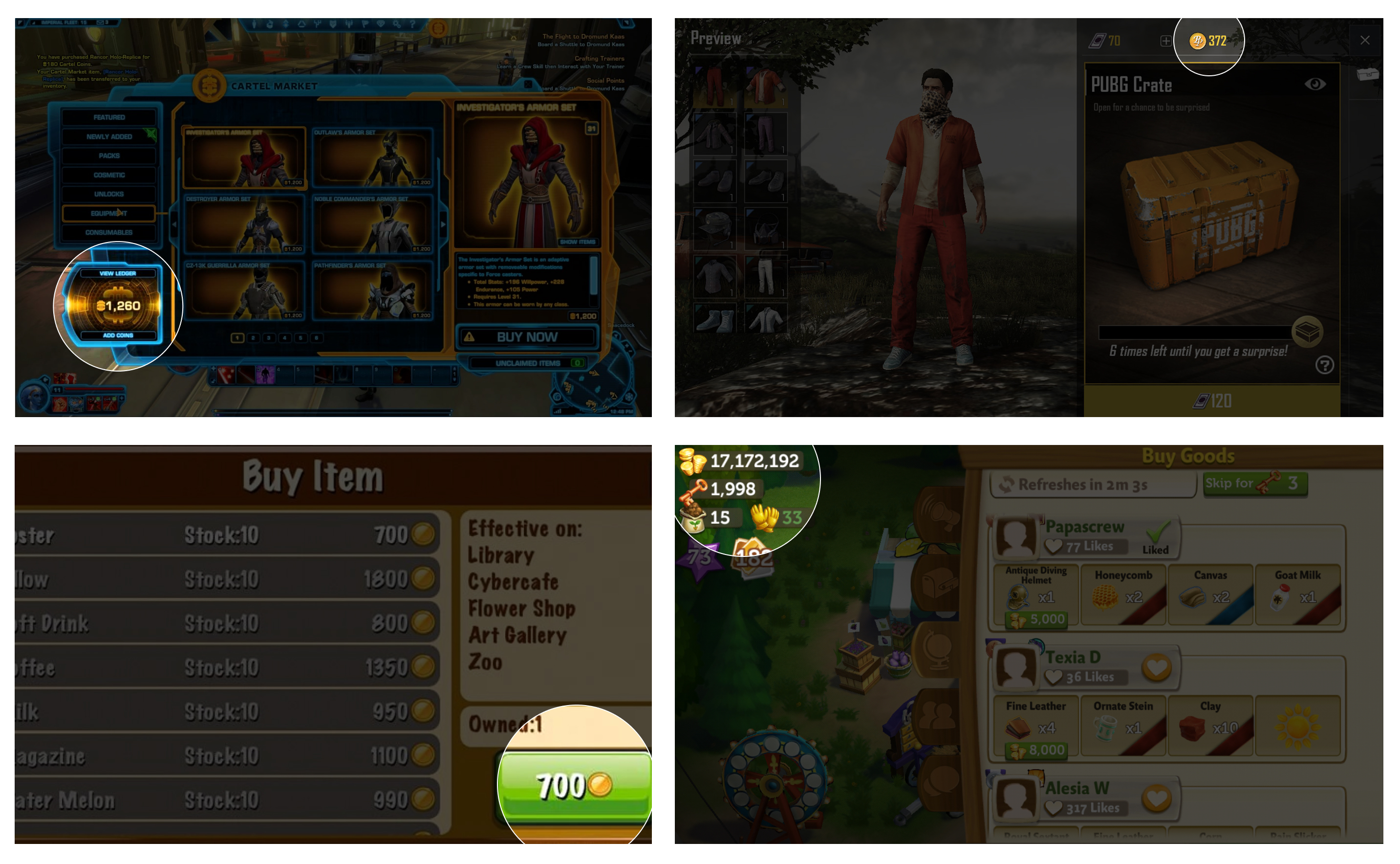
To ease the contemplation, I borrowed a concept from online brokerages and video games. In them, a user loads their account with money to spend in-app. This idea seemed fitting for an app seeking to capitalize on desire and impulse by shortening the evaluation process a consumer has during that "value relative to current resources" part. Seeing a product's price directly beside available cash becomes a quick and easy evaluation, especially with positive visual indicators. Consumers may also already consider the money "spent" once it's in the app and may feel more comfortable purchasing.
Obviously, this concept assumes a lot about how effective the platform is at tailoring consumer interests and if the breadth of products, services, and experiences are an incentive for users to load for future purchases, but at a high-level it reinforces the notion that what we see and hear is what we value and buy, by integrating a cash account into a content-rich app. It also opens up the opportunity to introduce incentives by way of cash credits through engagement, so there's less reliance on a user having to load and spend real money.
Cart-less
While this has logistical considerations, removing the cart further reduces the implication that a user is exiting a content state to enter a transactional one.
Let's get deep: The idea is, with an application that personifies content as the catalyst to commerce, the expectation is that there is such a tight gap between the intent (to purchase) and what sparked it, that satisfying that intent should be fluid. This is contrary to a cart which represents the deference of intent because the content that influenced it may be minutes, months, or miles away from the moment a consumer actually transacts.
Post Transaction
The goal to reduce the feeling of separate experiences carries through post-transaction when considering how traditional transactions end. After confirmation a consumer is typically brought to a "Thanks for purchasing" screen that prompts them to "Check out these similar products"; to which they close the tab and do an activity that has nothing to do with buying things.
This posthumous, weighted feeling of transacting is part of the reason there was an emphasis on a cart-less, singular purchase, but is also an important factor in reducing segmentation. This is achieved by minimizing the transaction to prioritize the content.
Informing a user that their order is "on it's way!" is typical of traditional commerce to ensure a comfortable descension from purchase. But, in an integrated experience, this persistent messaging disrupts the goal of fluidity.
To avoid this, the confirmation was integrated into the content as well as collapsing the product carousel. With this, all reminders of purchase are minimized to prioritize the next steps of engaging back with content.
This also includes the order and shipped confirmations. Again in reference to the maturity of the idea, instead of being baited by 4 email notifications, the user can seek out these details when they choose, in-app.
In reality, discovery, desire, intent, impulse, etc. are the result of many inputs: things seen in the street, articles, videos, commercials, topics discussed with friends, etc. While the journey is universal, the steps are variable. To replicate this discovery-to-desire, this app would have to replicate the variable reality of all those inputs. The ubiquity of social media and the influence of... influencers... have made that seem closer to reality, but there's no telling the true weighting of influence.
It also vastly underestimates the importance of product information. While content and the narratives they portray are the most important in building desire (hence commercials), there is another stage of simple information gathering (How big is it? What's it made out of? Where's it coming from?) that is present in decision making and can't be supplemented by stylistic lifestyle shots or author endorsements. Understanding these other aspects of the relationship between content and commerce means future iterations would seek to consider that as content and integrate into the experience as well.
A version of this concept seemingly exists with the giants tracking users as they traverse around the internet, but a clear monolith who both influences desire and capitalizes on it is not yet as clearly packaged under one company, let alone one app.
However, tackling that premise, and envisioning what that experience would look like—albeit a small fraction of it—was a ripe opportunity to explore possibilities and leverage constraints to push ideas past what's typical.