A web app redesign intended to update a legacy interface, developed into establishing a foundation for the present and future states of the platform.
Background
A Sales team’s goal is to efficiently book meetings. Meetings equals opportunities. Opportunities equals potential revenue. Revenue equals commission.
Structurally, that Sales team is run by a Sales manager, who equips them with the tools to book meetings. This platform was one of those tools.
At its core, it fairly distributed meetings amongst a Sales team, directly from a website form (Ex. “Book a Demo”).
User Types
In the current state, the concept of an Administrator’s view and an End User’s view showcased the difference between these 2 roles: Sales Manager and Sales Representative.
An Admin’s view enabled them to configure tools for an entire Team (personified as a Workspace), while the User’s view provided tools for their own personal use (somewhat like a personal Workspace).
The platform had 3 products in its current state: Meetings, Inbox, and Events. These products were only accessible via URL.
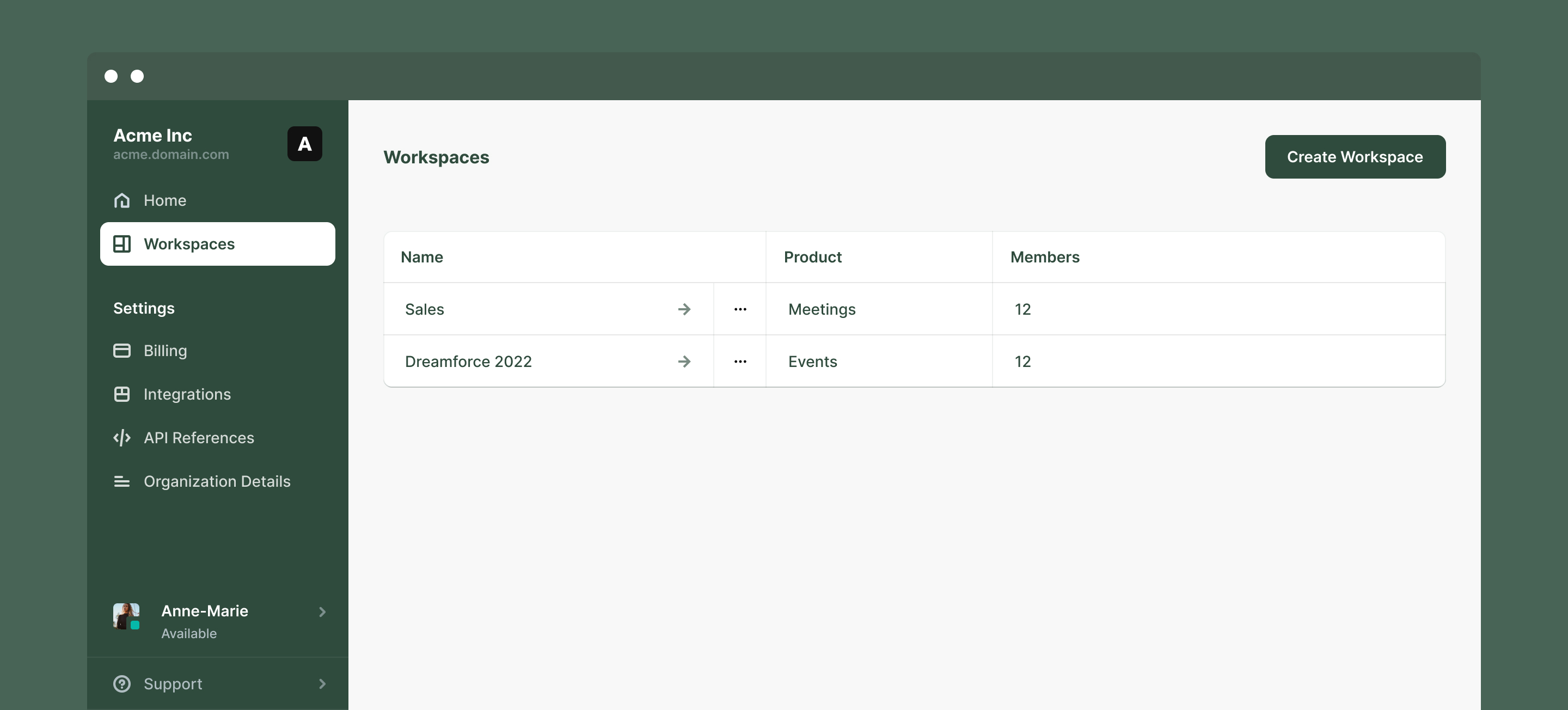
A feature brief posited that, while Users only needed to access their personal Workspace for each product, an Admin required a central location to manage all products, plus organization settings.
An app switcher was added to the redesigned top bar, so both Admins and Users could easily jump between apps. Additionally, the “Admin Center” was created to act like a home page for Admins, with a link to all of these areas, accessible from the app switcher.

Workspaces: Categorization
Once in a Workspace, all of the menu items visually appeared to be of the same type, but could be categorized as Tools, Assets, and Settings.
The simple adjustment here, was to communicate and visualize this.

Tools & Assets: Layout
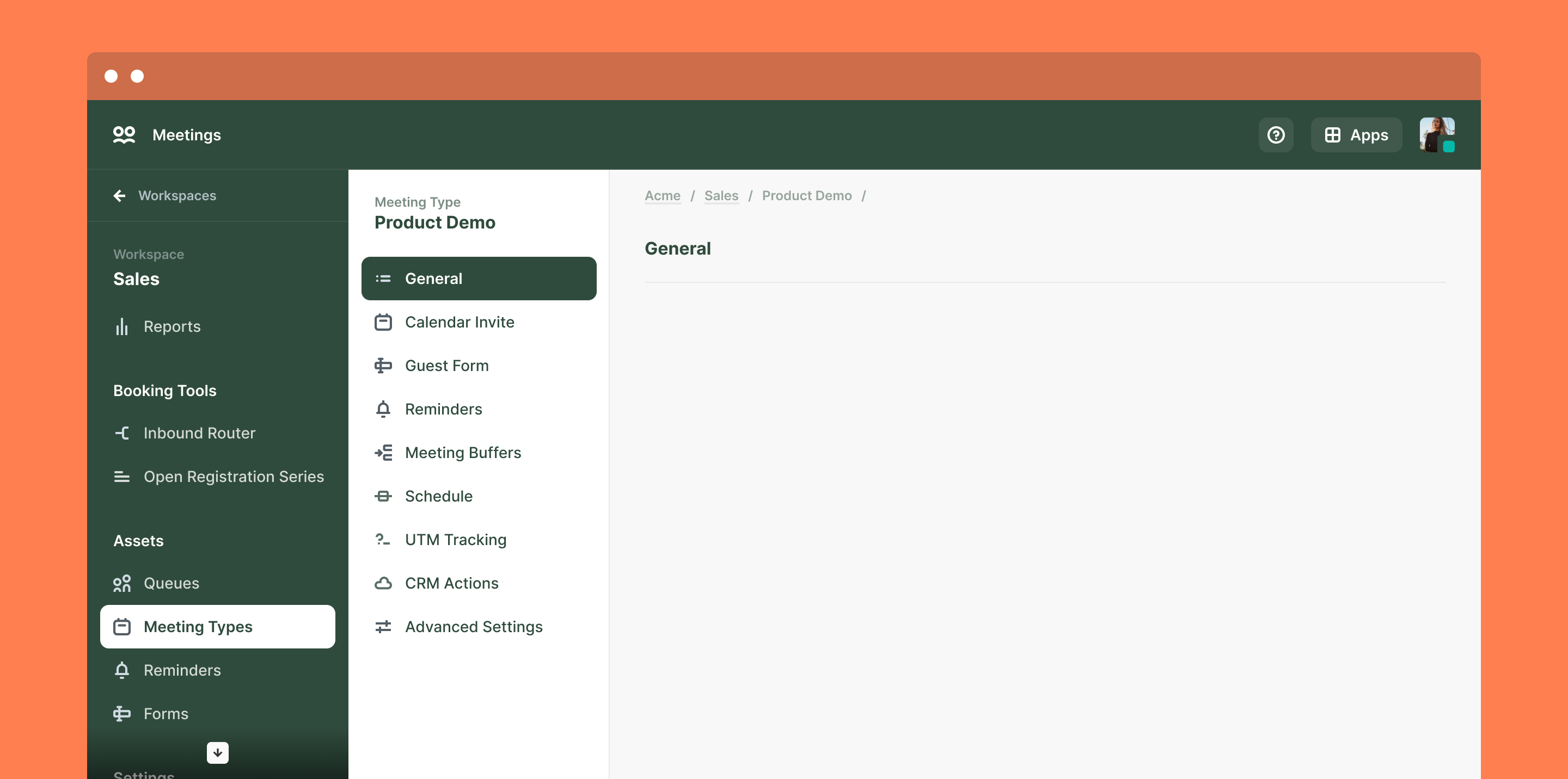
The navigation for a Workspace was positioned on the left as tabs to navigate between Tools, Assets, and Settings.
Once opening one of those Tools, Assets, or Settings, the structure shifted to accordion sections.

In the current state, this was a sensible approach, considering most settings were checkboxes, toggles, and inputs.
However, it was obvious it would quickly become ill-fitted for scale as briefs for features required more space-intensive elements like tables, lists, workflow builders, etc.
The advantages that a persistent left navigation afforded for a Workspace, naturally would apply for any Tools, Assets, or Settings that needed to accommodate complexity:
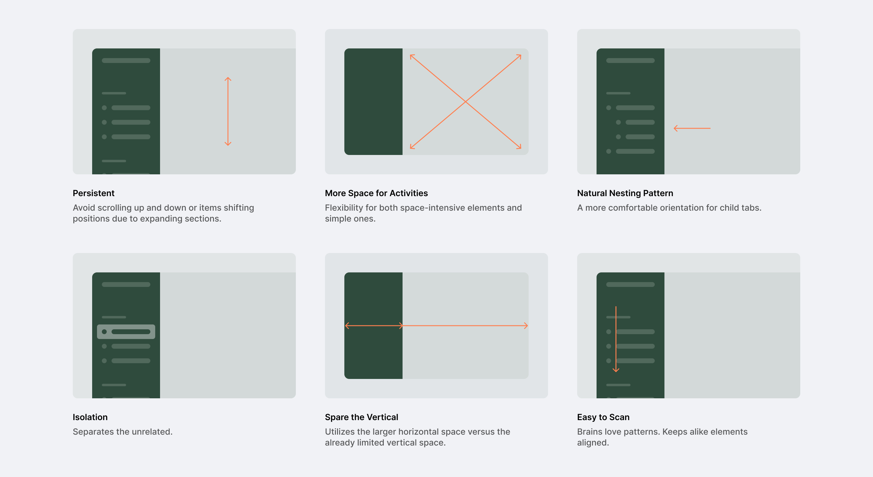
The result:
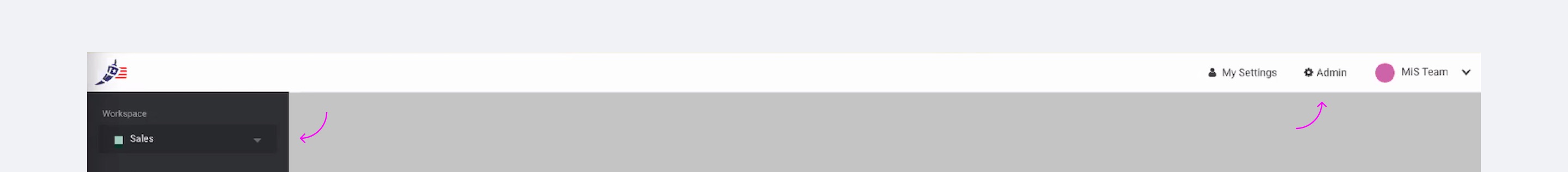
For all the advantages that left navigation affords, it means that there’s less opportunity for navigation higher in the hierarchy to remain persistent.
The result is the above, a visually overwhelming interface with a top bar and 2 left navigations.
Option 1 is to do what the legacy state did and employ different
navigation approaches for each object.
Option 2 is to use a similar navigation pattern, and isolate the
navigation of the active object.
The term object here is in reference to a concept borrowed from relational databases. There, an object has properties, and an object can be related to another object either as a sibling or a parent-child.
This structure abstracted from an interface helps understand the architecture of an app in its simplest form and informs where similar patterns can be applied.
At this stage, I took a step back to understand what this object structure was, and how an Admin may interact with them, to understand which style of navigation is the clearest for the tasks an Admin is trying perform.
Understanding the Architecture
After clicking through all pages and settings, the structure looked something like below...

...where an Organization contains Workspaces. Workspaces contain Tools and Assets. Assets are reusable objects that are used in Tools and other Assets.
Understanding this, all objects could be given the same navigation pattern as a sidebar.
To reduce cognitive load, it felt necessary to isolate the active object and its navigation by using the User’s intent (clicking into an object) as an action to inform what information to isolate—in this case the object they opened.
This resulted in redesigning the topbar as a sidebar, like the other objects.
The app switcher was deprecated after consolidating the concept of an App and a Workspace. When selecting an “App”, an Admin was simply being dropped into the last Workspace they were on for a given “Product”—revealing product, as simply a property type of a Workspace.
Meaning, this app switcher context could be foregone if a User selected the Workspace directly, where it is already separated by product type.
After deciding to isolate an object’s navigation, traversing the objects came down to 2 options: a single-window approach, and a multi-window approach.
In the single window approach, the User’s profile and Support are fixed to the Organization (the topmost object) and that object is persistent and collapsed. This option implies that the object relationship is parent-child, as a User can only navigate forwards/backwards (open/exit).
In the multi-window approach, the User’s profile and Support are not bound to an object, but persistent, where all other objects appear in isolation on separate tabs. This option acknowledges both a parent-child and sibling relationship, as an Admin can open these objects simultaneously.
Option 2 was deemed too experimental for the short term, so Option 1 was implemented with a note to revisit when the necessity to create, read, update, and delete sibling objects in context was higher priority.
Redesigning Settings
As a platform enabling automation, it is naturally very settings and configuration heavy.
The redesign of these settings was beyond an interface refresh and began with a pain point about checkbox settings.
The language paired with the state of the checkbox wasn’t always clear what action a setting was performing.
Sometimes the language was phrased to do something, while other times it was the opposite.
Sometimes a checkbox was used, while other times there was a toggle.

To avoid any confusion, it felt necessary to clearly describe the two options, and enable the Admin to select the one that they want, so that when they’re scanning through their settings, it’s clear what action is occurring.
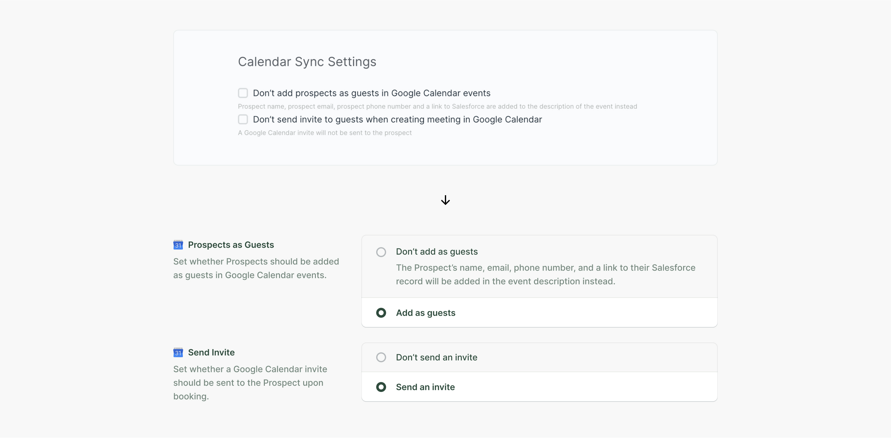
While commanding more space, clarity is paramount in an automation-enabling application.
Layout-wise, a two-column approach ensured that Admins could easily scan alike elements, especially for pages with a long list of settings.
However, this approach did not only apply to radio options. The text + box approach meant any kind of setting, form field, object attachment, etc. could employ a similar pattern.

Conclusion
A personal, universal principle is to design with consistency, yet flexibility.
Consistency is the guiding light for ensuring Users have a similar experience for doing similar things, within the borders of your application.
Flexibility accounts for scale. While a designer may not always be able to anticpate every what-if, there are architecture and layout principles that can be applied to ensure new information requiring new design elements doesn’t radically alter the foundation.
These principles are rooted in simplicity. Not the kind of simplicity that omits information, but the kind that identifies patterns in order to reduce variance, and intentfully present information.